


Understanding the Dashboard
Discover your administration dashboard with all its charts and graphs. Stay up-to-date on everything happening in your school — all on a single page.
Overview
The Dashboard is the first page you see when you log in to WhitePenguin as an Admin. It gives you a real-time, bird's-eye view of your school's key metrics — students, teachers, open enquiries, waitlist, attendance, financial health, and earnings — without needing to navigate through multiple sections.
Features & Benefits
- Instant school snapshot — See the most important numbers at a glance the moment you log in.
- Real-time data — All cards, charts, and graphs reflect live data from your school's records.
- Flexible filtering — Narrow down data by a specific date range or classroom to focus on what matters.
- Action Centre alerts — Get notified of items needing immediate attention (overdue payments, booked tours) right on the Dashboard.
- Attendance visibility — Monitor daily attendance trends for both children and teachers, and review insights like best/worst days and weekly trends.
- Financial overview — Track revenue, outstanding fees, paid vs. unpaid ratios, and overdue invoices in one place.
- Earnings tracking — Keep an eye on your school's weekly revenue without opening the Invoicing section.
- No extra setup needed — The dashboard populates automatically as you add children, teachers, classrooms, and admissions.
Summary Cards
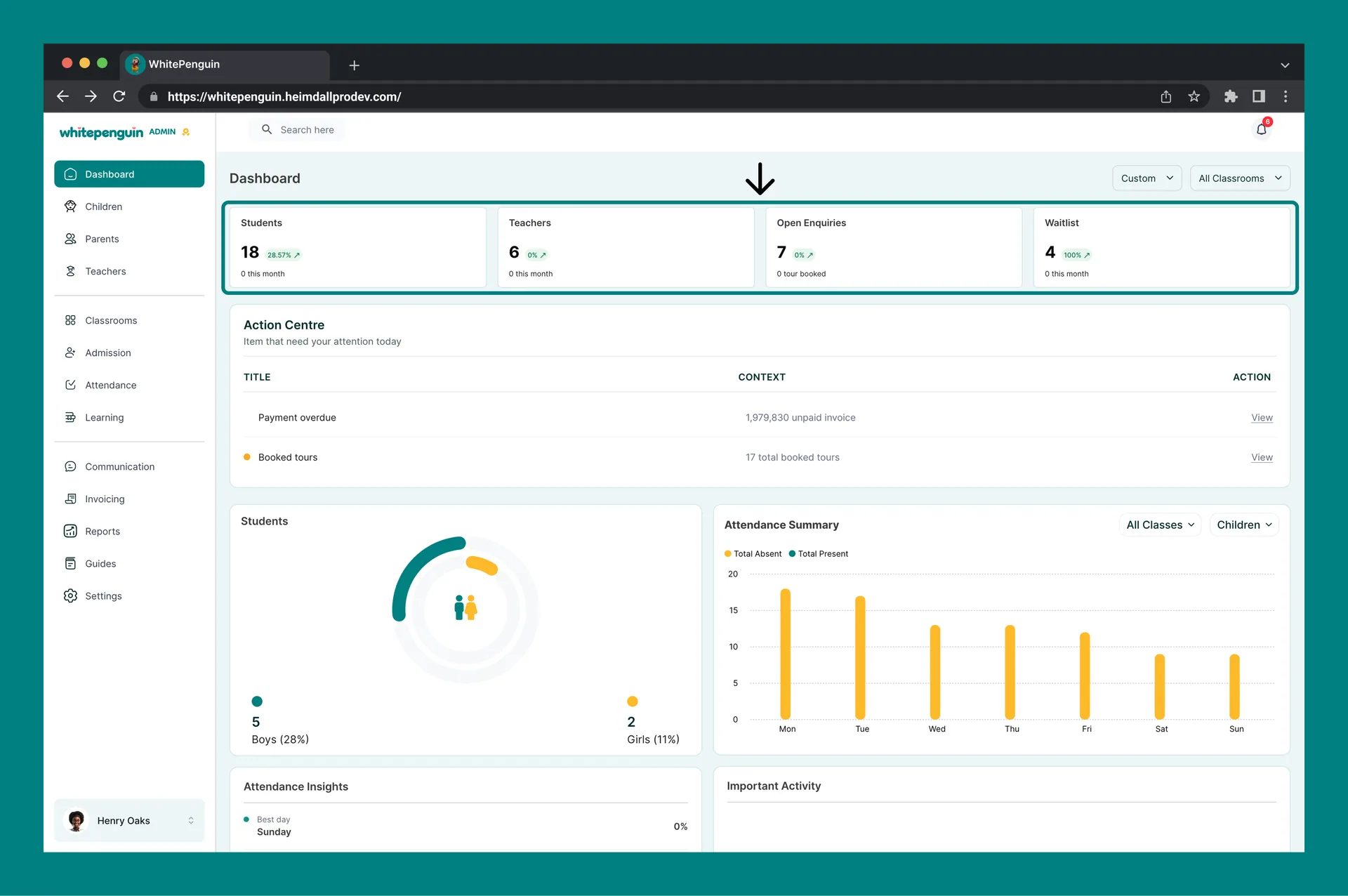
At the top of the dashboard you will find four summary cards. Each card displays a count for the current filter period, a percentage change badge compared to the previous period, and a sub-note.
| Card | What it shows | Why it matters |
|---|---|---|
| Students | Total number of enrolled children (with % change & "0 this month" note) | Track enrollment growth or drops over time |
| Teachers | Total number of active teachers (with % change & "0 this month" note) | Monitor staffing levels at a glance |
| Open Enquiries | Total open admission enquiries (with % change & "0 tour booked" note) | Track prospective families who have expressed interest in your school |
| Waitlist | Total children currently on the waitlist (with % change & "0 this month" note) | Monitor demand beyond your current capacity |
The percentage badge on each card (e.g., -100% or 0%) shows the change compared to the previous equivalent period. A green arrow means growth; a red arrow means a decline.
Action Centre
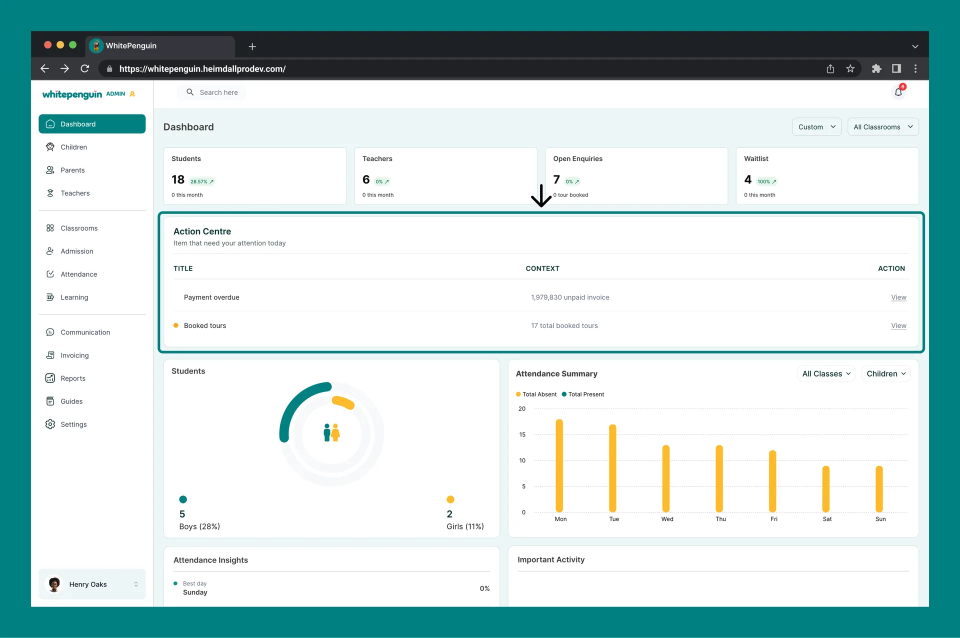
Directly below the summary cards, the Action Centre highlights items that need your immediate attention today. It is updated in real time as new events occur across the school.
| Column | Description |
|---|---|
| Title | The type of alert (e.g., Payment overdue, Booked tours) |
| Context | A short summary of the alert (e.g., 1,926,530 unpaid invoice, 17 total booked tours) |
| Action | A View link that takes you directly to the relevant section to resolve the item |
Common Action Centre alerts:
- 🔴 Payment overdue — One or more invoices are past their due date. Click View to go to the Invoicing section.
- 🟡 Booked tours — Parents have booked school tours. Click View to manage tour bookings in the Admission section.
The Action Centre only shows items that require attention. If everything is on track, this section will appear empty. Check it daily as part of your admin routine.
Attendance Summary
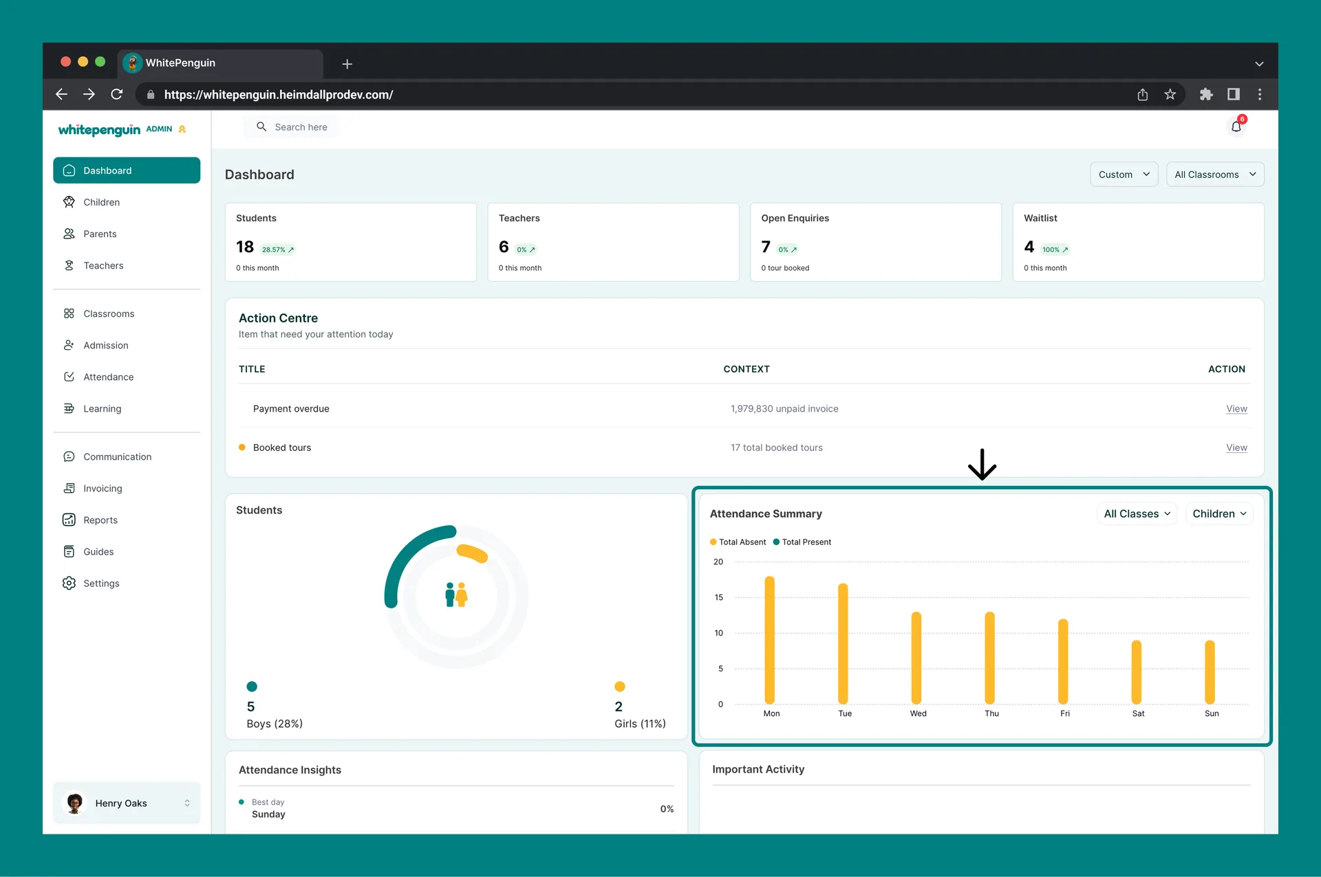
The Attendance Summary chart shows daily attendance trends for the selected period. It is located in the upper-right area of the dashboard.
Reading the Chart
-
The X-axis shows the days of the week (Mon → Sun).
-
The Y-axis shows the number of attendees (scales with your data).
-
Two data series are plotted:
- 🟠 Total Absent — children or teachers who were marked absent
- 🟢 Total Present — children or teachers who were marked present
Switching Between Views
The Attendance Summary chart has two dropdowns in the top-right corner:
- All Classes / [Classroom name] — filter attendance data by a specific classroom or view all classrooms combined.
- Children / Teachers — switch between attendance data for enrolled children or teaching staff.
This lets you drill into attendance for a specific classroom and quickly compare child vs. teacher availability on the same day.
Attendance data only appears after teachers or admins have logged attendance for the day. If the chart is empty, make sure attendance has been recorded for the selected period.
Attendance Insights
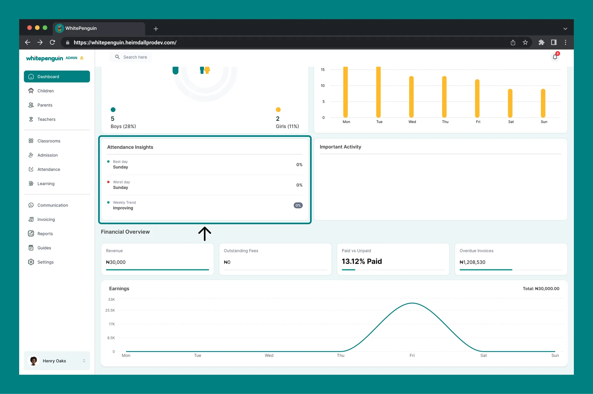
Below the Attendance Summary chart, the Attendance Insights panel gives you a quick analytical summary of attendance patterns for the selected period:
| Metric | Description | Example |
|---|---|---|
| 🟢 Best day | The day of the week with the highest attendance rate | Tuesday — 11.76% |
| 🔴 Worst day | The day of the week with the lowest attendance rate | Sunday — 0% |
| 🟢 Weekly Trend | Whether overall attendance is improving or declining, with a percentage badge showing the change | Improving — -3.51% |
Use Attendance Insights to spot patterns over time. If the worst day is consistently the same, it may indicate a recurring issue (e.g., parents scheduling appointments on that day). Share these insights with teachers in your weekly briefing.
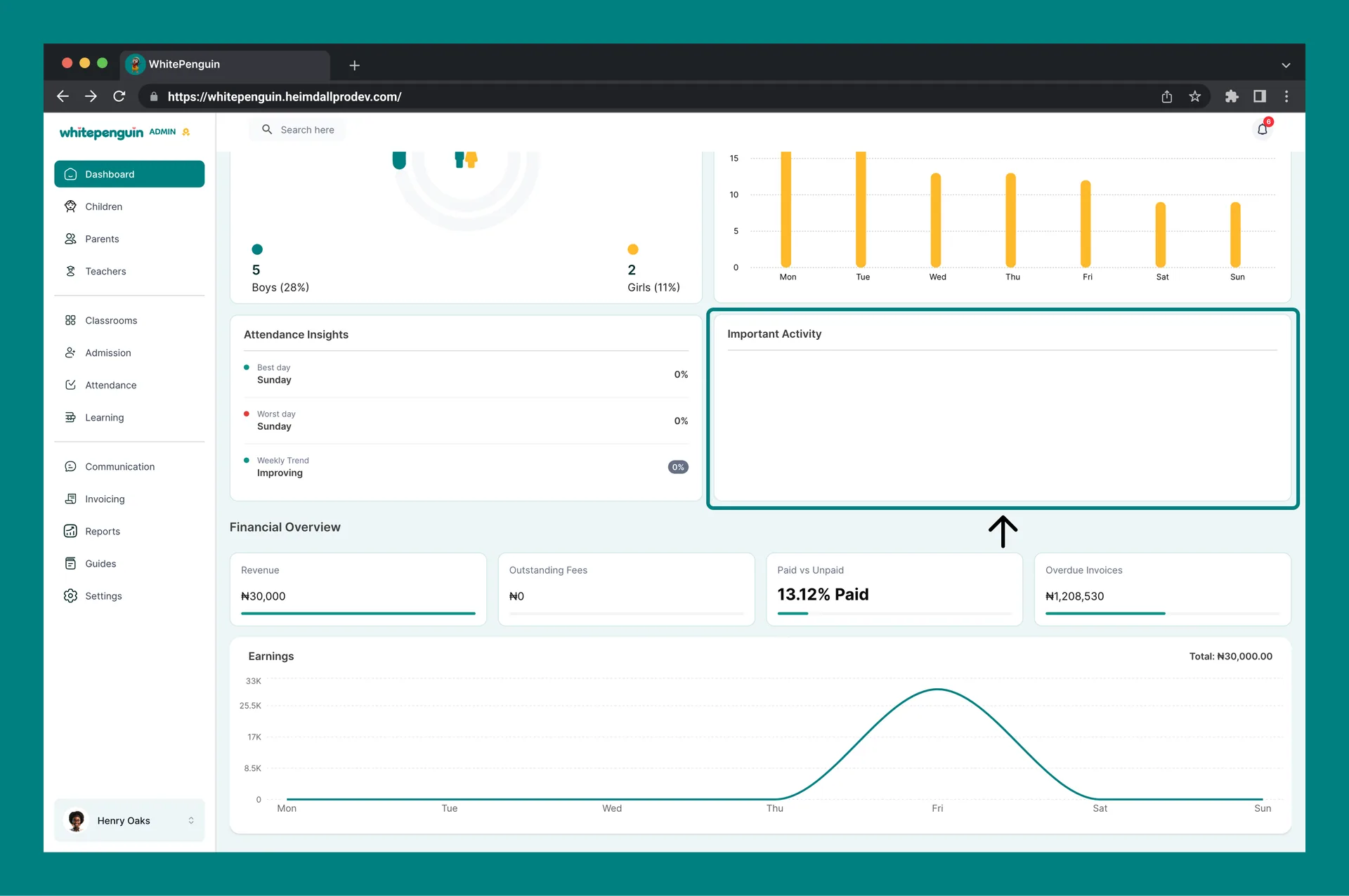
Important Activity
The Important Activity section sits alongside the Attendance Insights panel and surfaces recent significant events in the school — such as new admissions, new messages, payment activity, or other notable actions taken by staff or parents.
- This section updates automatically as activity occurs.
- If no significant events have occurred recently, the section will appear empty.
- It acts as a quick audit trail so admins can stay informed without checking every section individually.
Financial Overview
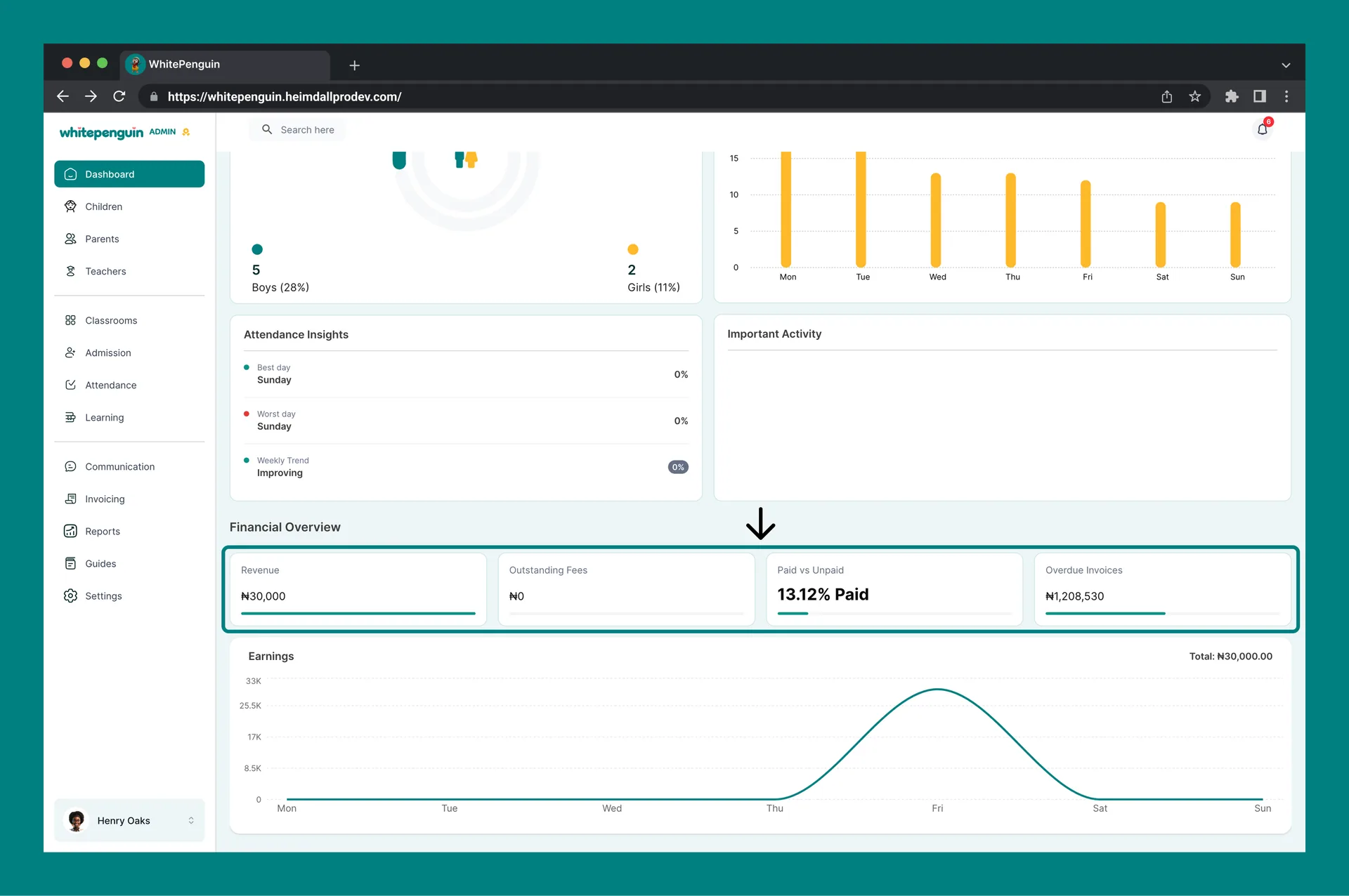
The Financial Overview section provides a snapshot of the school's financial health for the selected period. It sits below the Attendance Insights and Important Activity panels.
| Card | What it shows | Why it matters |
|---|---|---|
| Revenue | Total payments received in the selected period (e.g., ₦0) | Track income collected from parents for the period |
| Outstanding Fees | Total fees not yet collected (e.g., ₦0) | Identify the total amount still owed to the school |
| Paid vs Unpaid | Percentage of invoices that have been paid (e.g., 13.43% Paid) | Quickly gauge collection performance at a glance |
| Overdue Invoices | Total value of invoices past their due date (e.g., ₦1,167,530) | Flag urgent follow-ups needed with parents |
Overdue Invoices are also flagged in the Action Centre at the top of the Dashboard. Click View in the Action Centre to go directly to the Invoicing section and follow up with parents.
Students Overview
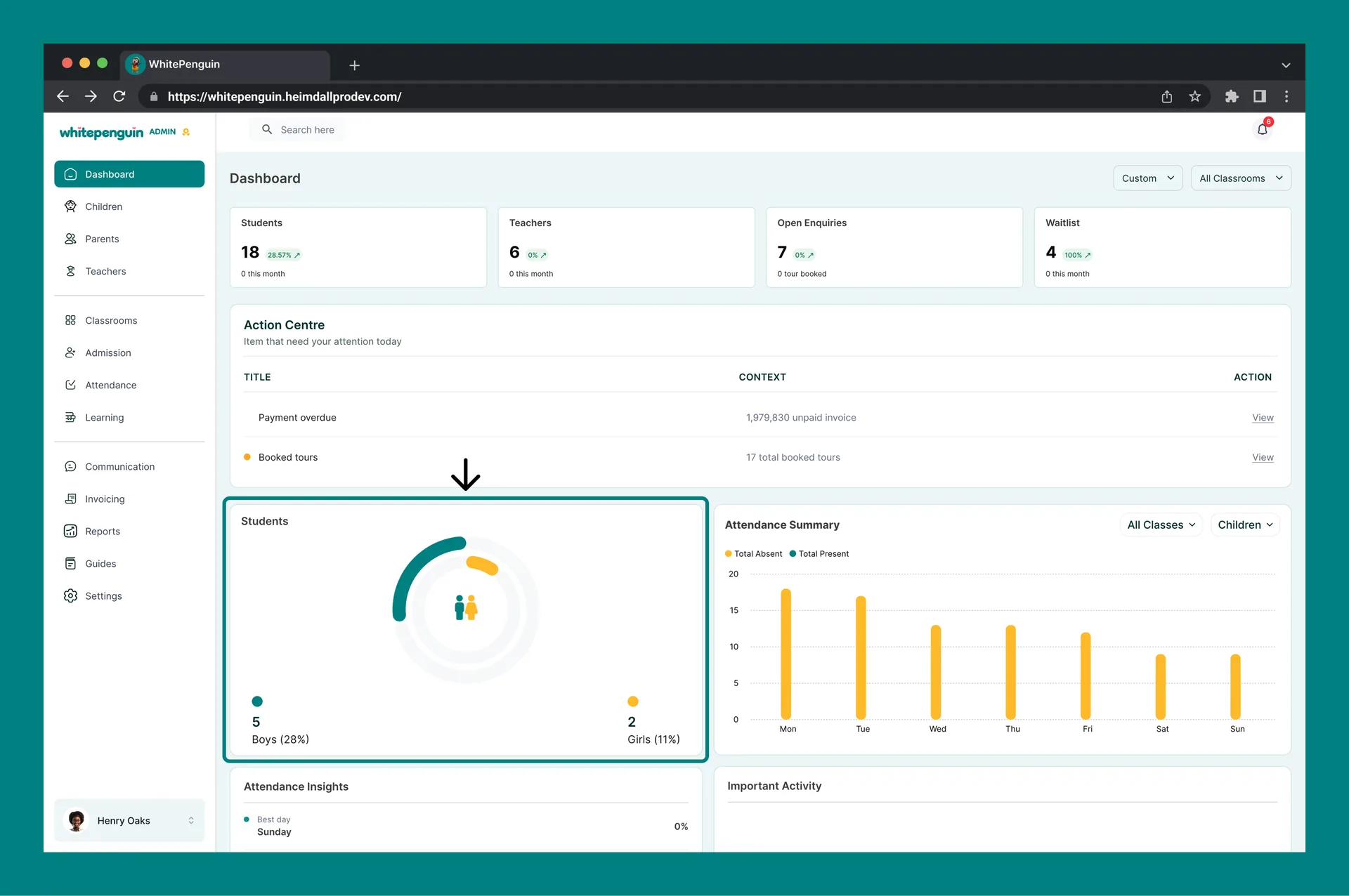
The Students section displays a donut chart that breaks down your enrolled children by gender:
- 🔵 Boys — shown in teal with a count and percentage
- 🟡 Girls — shown in yellow with a count and percentage
This chart updates automatically as you add or update children profiles.
Earnings Bar Chart
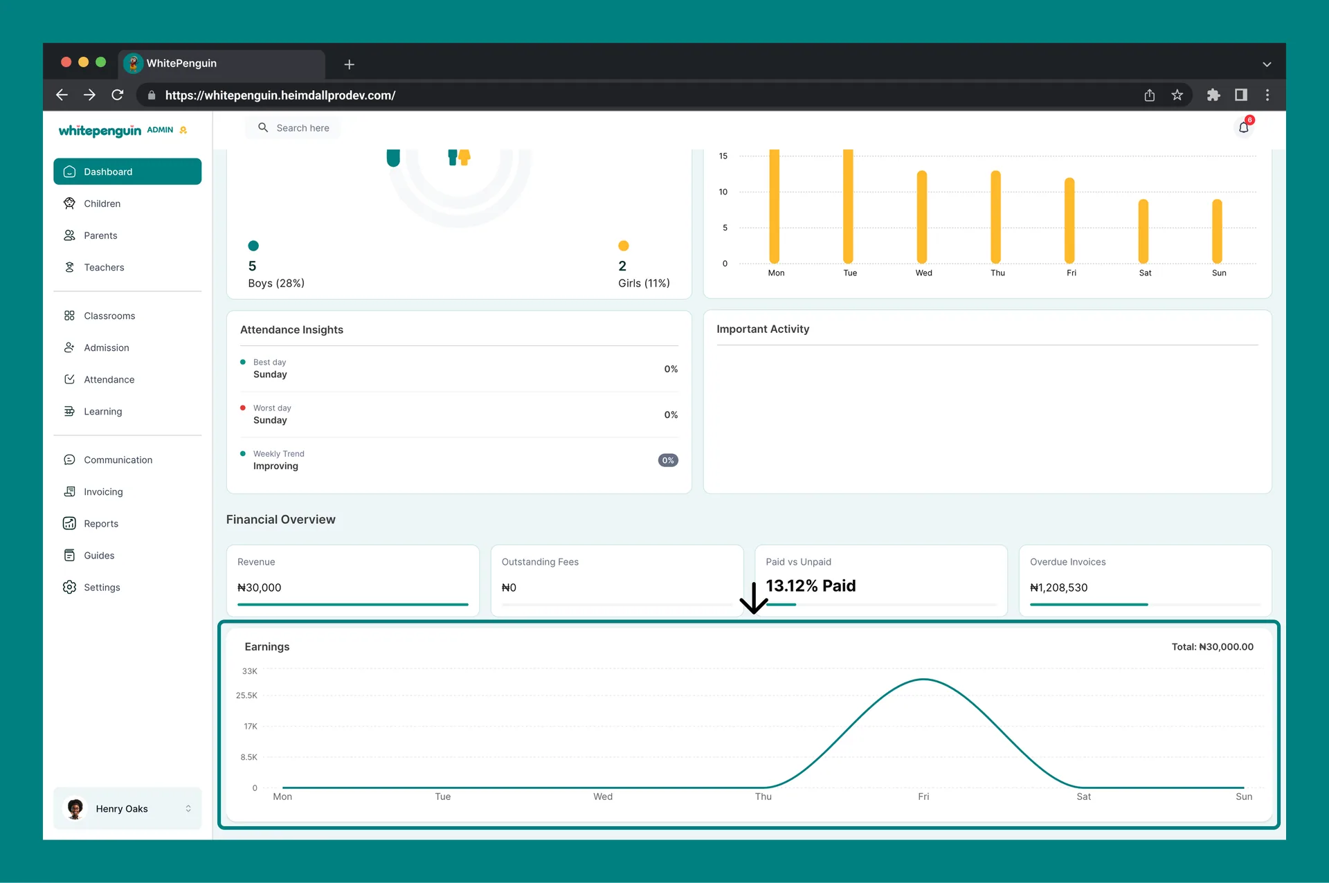
At the bottom of the Dashboard, the Earnings chart displays your school's revenue over the selected week, broken down by day (Monday through Sunday). The total is shown in the top-right corner of the section. Use this chart to:
- Spot high-revenue days
- Identify weeks with low billing activity
- Track the financial impact of new admissions or recurring invoices
Filters: By Date & Classroom
You can control what data appears across all dashboard sections using the two filters at the top-right of the Dashboard page.
Date Filter
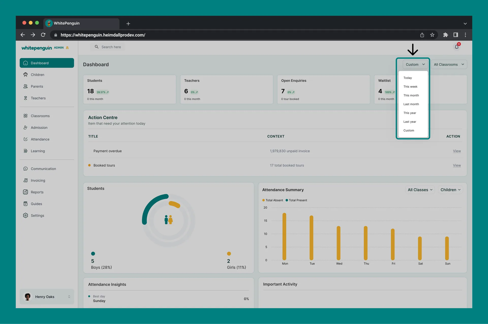
Click the "This week" dropdown to change the time period:
- Today — shows data for the current day only
- This week — default view, shows data for the current calendar week
- This month — shows data for the current calendar month
- Last month — shows data for the previous full month
- This year — shows data for the current calendar year
- Last year — shows data for the previous full year
- Custom — pick any specific start and end date to define your own range
All cards, charts, and the attendance summary update instantly when you change the date filter.
Classroom Filter
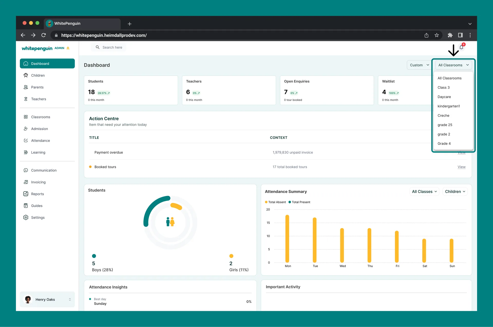
Click the "All Classrooms" dropdown to filter data by a specific classroom:
- All Classrooms — default, aggregates data from every classroom
- [Classroom name] — select any classroom to see metrics only for that group
This is especially useful for school admins managing multiple age groups or rooms, allowing you to drill into the performance or attendance of one classroom at a time.
FAQs
This usually means no records exist for the selected date range. Try switching the date filter to "This month" or "All time". If counts are still 0, make sure you have added children, teachers, or classrooms in their respective sections.
The chart is empty when no attendance has been logged for the selected period. Ask your teachers or admins to record daily attendance via the Attendance section, then return to the Dashboard to see it reflected.
It shows the percentage change compared to the previous equivalent period. For example, if you are viewing "This week" and the Students card shows -100%, it means there were no new students enrolled this week compared to last week.
Not simultaneously on the same chart. Use the Children / Teachers dropdown on the Attendance Summary to toggle between the two views. For a combined report, visit the Reports → Attendance section.
The Action Centre is a panel below the summary cards that flags items needing your attention today. Common alerts include:
- Payment overdue — unpaid invoices past their due date
- Booked tours — school tours booked by prospective parents
Click View next to any alert to go directly to the relevant section. If nothing needs attention, the Action Centre will appear empty.
The Financial Overview shows four financial metrics for the selected period: Revenue (collected payments), Outstanding Fees (uncollected), Paid vs Unpaid (collection rate %), and Overdue Invoices (total value past due). Use it to quickly assess your school's financial health without going to the Invoicing section.
The Dashboard itself does not have a direct export button. For detailed exports, navigate to the Reports section where you can download Attendance, Children, Billing, and Admission reports.
Earnings data comes from paid or issued invoices in the Invoicing section. If no invoices have been created or marked as paid in the selected period, the chart will appear empty. Make sure invoices are set up and payments have been recorded.
- Open Enquiries — families who have submitted an enquiry form or expressed interest in enrolling a child. The "0 tour booked" sub-note shows how many of those enquiries have scheduled a school tour.
- Waitlist — children who have been added to the school waitlist because enrollment is full. Monitor this to anticipate future capacity needs.
"All Classrooms" aggregates data across every classroom in your school. When you select a specific classroom, only the children and teachers assigned to that classroom are counted. Discrepancies are expected and are not a bug.
Last updated on
Sign Up & Getting StartedSoon
Learn how to create and activate your admin account and add your school information to get started using WhitePenguin.
Using Full Search Feature
Discover how to use the Full Search feature to quickly find any parent, teacher, or child in your school — all from a single search bar.